Showing posts with label Research. Show all posts

Thursday, 26 January 2017

TYPOGRAPHY & FONT STYLES

What are typography and font styles?

A typography is the style and appearance of arranging font to be legible, readable and appealing when used. The arrangements of typography varies from the point sizes, line spacing, typefaces, and letter spacing. On the other hand, font style refers to the size, weight, colour and style of typed characters. 
The importance of both are that they add emphasis to what is written and bring life to word, sentence, or phrase. Also, certain fonts are used for certain type of texts.
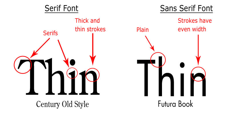

Image result for serif and sans serif fonts

Difference between Serif and Sans Serif:

Serif fonts have details or small decorative flourishes on the ends, for example - Times New Roman. These types of fonts tend to look olden styled and are used in lengthy texts or formal writing.Also, serif font is used for printed work as they are easier to read in comparison to sans serif. This is because, serif font makes letters more distinctive therefore our brains recognise the letters quickly, whereas if they are not serif then the brain takes longer to identify each letter. Sans serif does not have these details or flourishes, for example - Arial. Sans serif font is mostly used on online on social media such as Facebook, Twitter, Instagram as it is simple and mostly associated with a younger audience.


Examples of sans serif fonts:
Image result for examples of sans serif fonts

Examples of serif fonts:

Image result for serif fonts


POP Magazine:


Image result for pop music magazines
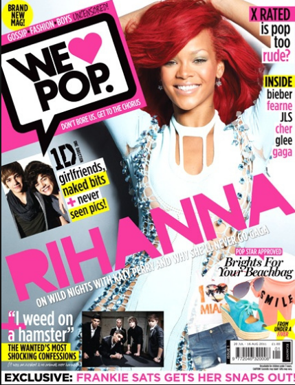
The font for this magazine is sans serif as seen through the masthead as well as the headlines. The colour scheme is pink and yellow which has connotations of femininity. The colour pink is pretty and mostly associated with females or gentle girls. The genre of the magazine is 'POP' which has been outlined through the bold font  of the masthead "We love POP." 


Rap Magazine:


Image result for vibe magazine The genre of this issue is Rap which is evident through the use of bold red and black font. As these colours are dark,they connote masculinity which indicates that the target audience for this magazine will be males. Also, the font is sans serif is more rough and masculine therefore suits the genre of the magazine.


Through my font type research, I have chosen 5 font types that I believe that will be conventional to the genre of Hip-Hop. Through the research and analysis of already existing Hip-Hop magazines, I came to the conclusion of using "True Lies" as I liked the sans serif, sharp lines effect. "True Lies"  is a thin font in comparison to the others which are bold.  Through the simplistic font type for my masthead, I will be able to use other elements within the magazine to get the audiences attention rather than attracting the audience through the masthead.


All these fonts were found on DaFont.com


QUESTIONNAIRE GRAPH RESULTS


CONCLUSION:
These are my questionnaire results which I have gathered from students in my school via my questionnaire. Through these results I came to the conclusion for my target audience as well as genre. This was beneficial to me as it guided me when planning and producing my product. 

 Also, as evidently seen in the results of one of the questions the topic in which people are most interested in are the interviews. Through this I decided to include an interview for my double page. Through these results, I was able to include conventions that appeal to my specific genre as well as target audience. Reflecting back on these results I would guarantee a successful final product.


It was very important to analyse these results and come to the conclusion that the highest results for the favourite genre was Hip-Hop therefore that would be the genre of my product as it made me aware that there is a mass audience interested in this.


PRIMARY AUDIENCE RESEARCH (QUESTIONNAIRE)

Create your own user feedback survey


What is the importance of primary research?

The importance of our primary research was to gain information about music magazines and the people they appeal to. Through these questions, I ensured to cover all small details that I would need to know when planning and producing my magazine. The 10 questions I asked were straight forward,which either consisted of option boxes they were able to pick from,or the specifying option.  For example, the question which asked to specify allowed me to get a wider description of their answer, as well get an answer if the options did not meet their needs/answers.

The advantages of questionnaires:
- Easy way of collecting data from people
- A quick way of collecting the data without boring or tiring anyone
- The results are easy and quick to produce

The disadvantages of questionnaires:
- Inadequate way to understand some information for the readers
- Lacks validity as we are not sure if answers were reliable and valid
- Questions can be skipped

The people that answered my questionnaire were students from year 7-13. The reason for this is because I wanted to collect data from students that are into music and magazines. I also understand that with different ages there are different interests which appeal to them. Different age groups like different things which I made sure to include in my magazine. 


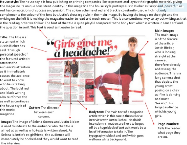
ANALYSIS OF DOUBLE PAGE'S GRAPHIC ELEMENTS


These are the three double page spreads that I have chosen to analyse. All three magazines are different as I wanted to ensure that I could identify different graphic elements and understand whether they are conventional or unconventional. Some of the elements that I analysed were- main images, body text, pull quotes, house style, colour scheme and many more.


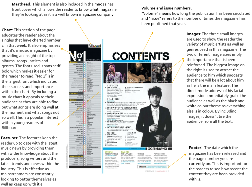
ANALYSIS OF CONTENTS PAGE'S GRAPHIC ELEMENTS


AUDIENCE PROFILING


ANALYSIS OF MUSIC MAGAZINE COVERS


MAGAZINE FRONT COVER - CODES AND CONVENTIONS